Why should you be Interested?
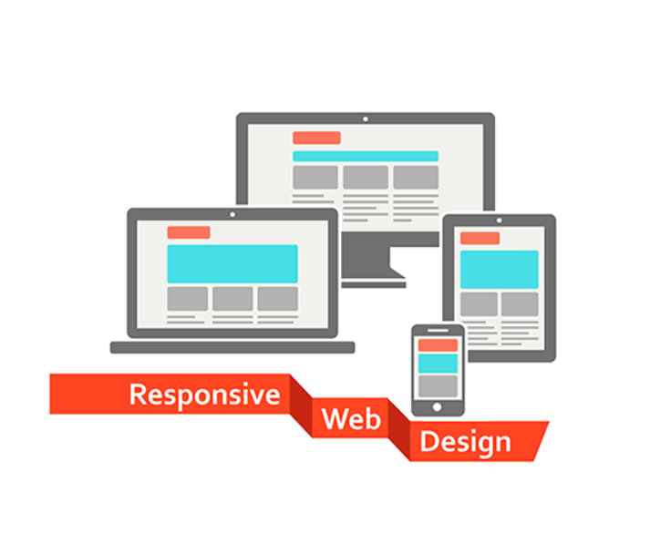
Responsive Web Designing: Creating a User-Centric Digital Experience
In today's age, having a responsive website is crucial for businesses to reach and with their target audience With the increase in mobile and tablet usage, it's essential websites to adapt to screen sizes and devices. This is where responsive web designing comes play.
What is Web Designing?
Responsive web designing is an approach to web design that makes web pages render well on a variety of devices and window or screen. This means that the layout of the website will adapt to fit different screen sizes, that users have an optimal viewing experience regardless of the device they are using.
The Importance Responsive Web Designing
With the majority of internet users accessing websites through mobile devices, a responsive website has become non-negotiable. A non-responsive website can lead to user such as text being too small to read, images not loading properly, or being close together for easy navigation.
In addition, search engines like Google prioritize mobile websites in their search results. This means that if your website is not responsive, it be penalized in terms of its search engine ranking.
Creating a Seamless User Experience well-designed responsive ensures that users have a seamless experience regardless of how they access site. Content should easily readable and navigation should be intuitive across all devices.
One important aspect of responsive web is ensuring fast load times. Mobile users are often on-the-go and expect quick access information. Therefore, optimizing images and minimizing HTTP requests are essential for creating a fast-loading site.
Another key component of creating a seamless user experience through responsive design is touch-friendly elements. Since mobile users interact with websites primarily through touch gestures rather than mouse clicks,'s important for buttons links to be large enough for easy tapping without accidentally clicking on other elements nearbyBest Practices for Responsive Web Designing
When embarking on creating or redesigning your website with responsiveness in mind, there are several best practices should consider:
1) Mobile-first approach: Start by designing your website specifically for mobile before scaling up for larger screens.
2) Flexible grids: Use relative units like percentages of fixed units like pixels so that content can adjust fluidly based on screen.
3) Media queries: Implement CSS media queries to apply different styles based on device's characteristics such as width or orientation.